Colocalization of two proteins is
often used in biology to predict functional relationship between
them. In addition, we want to look at the colocalization protein with
some intracellular organelle to access the intracellular location of
the proteins. Recently, I came across such a problem in my work and
decided to learn analysis of cellular immunoflourescence images. Then
I stumbled upon the EBImage
bioconductor package. Using this package, I found it very easy and
convienient to do the image analysis. Here is the short tutorial of
how to find strength of colocalization of two colours in an Image.
Colocalize
<-
function(Image,
colors
=
c("red",
"green"),
progressbar
=
FALSE,
plot
=
FALSE)
{
suppressPackageStartupMessages(library(EBImage))
library(ggplot2)
library(ggthemes)
## ==================== Checking the Input
arguments========================= ###
if (!is.Image(Image))
{
stop("Enter
an Image object as input argument")
}
if (colors[1]
==
"red"
&&
colors[2]
==
"green"
|
colors[1]
==
"green"
&&
colors[2]
==
"red")
{
x <-
as.vector(imageData(Image)[,
, 1])
y <-
as.vector(imageData(Image)[,
, 2])
} else if (colors[1]
==
"red"
&&
colors[2]
==
"blue"
|
colors[1]
==
"blue"
&&
colors[2]
==
"red")
{
x <-
as.vector(imageData(Image)[,
, 1])
y <-
as.vector(imageData(Image)[,
, 3])
} else if (colors[1]
==
"green"
&&
colors[2]
==
"blue"
|
colors[1]
==
"blue"
&&
colors[2]
==
"green")
{
x <-
as.vector(imageData(Image)[,
, 2])
y <-
as.vector(imageData(Image)[,
, 3])
} else {
stop("Enter
Valid colours")
}
## ==================== Pearson Correlation
========================##
PCC <-
cor.test(x,
y)$estimate
names(PCC)
<-
NULL
### =================== Manders coeffients
=========================##
M1 <-
sum(x[y
>
0])/sum(x)
M2 <-
sum(y[x
>
0])/sum(y)
Manders <-
list(M1,
M2)
names(Manders)
<-
colors
## ==================== Costes Approach
============================###
vect <-
rep(0,
100)
if (progressbar) {
## Whether to show progress bar or not
pb <-
txtProgressBar(min
=
0,
max
=
100,
style
=
3)
## sets progress bar while running function
}
for (i in 1:100)
{
sample_x <-
sample(x,
length(x),
replace
=
FALSE)
sample_y <-
sample(y,
length(y),
replace
=
FALSE)
vect[i] <-
cor.test(sample_x,
sample_y)$estimate
if (progressbar) {
setTxtProgressBar(pb,
i)
}
}
if (progressbar) {
close(pb)
}
Costes <-
sum(abs(vect)
<
abs(PCC))/100
## ===================== Visualization
=============================##
if (plot) {
dat <-
data.frame(Red
=
x, Green
=
y)
lines <-
data.frame(x
=
seq(0,
1,
by
=
0.01),
y
=
seq(0,
1,
by
=
0.01))
p <-
ggplot(dat,
aes(Red,
Green)) +
geom_point(colour
=
"blue",
size
=
0.8)
+
geom_line(data
=
lines,
aes(x,
y), colour
=
"red")
+
theme_gdocs()
+
labs(title
=
"Scatter
Plot of Pixel Intensities")
print(p)
}
## ===================== OUTPUT
====================================##
return(list(PCC
=
PCC, Costes
=
Costes, Manders
=
Manders))
}
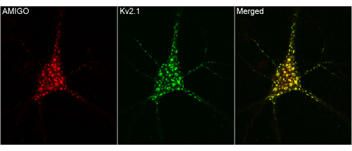
The following example demonstrates
the usage of the function. This is a trial image from internet.
First, lets manually examine the image. It seems more likely that
where ever red is present green is also there and viceversa. So, this
is a good image to start with the colocalization analysis. Now read
only the merged portion of this image into R workspace as shown below
and we can find the strength of colocalization by using the above function.
 |
| Colocalization using R |
library(EBImage)
Img
<-
readImage("Trial1.jpg")
Colocalize(Img,
colors=c("red","green"),progressbar=FALSE,plot=TRUE)
 |
| Colocalization using R |
$PCC [1] 0.9364601
$Costes [1] 1
Manders$red [1] 0.9989995
green [1] 0.8590056
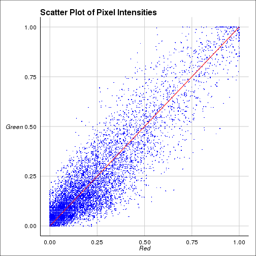
The coefficients shown above are
Pearson correlation coefficient(PCC) for the intensities between two
colors. Costes coefficient is PCC done 100 times with randomized
images and calculating how many times the original one is greater
than randomized one. Manders cofficients are calculated for two
colors seperately. For further details visit this link.


